A6 vs Happy Planner: Which Fits Your Life?
A6 vs happy planner: compare size, space, portability, and page options to choose printable inserts that make your everyday planning feel easier with purpose.
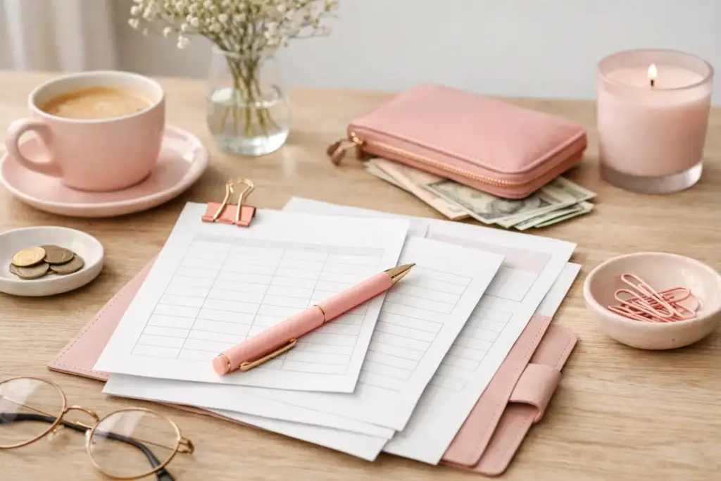
If your budget pages feel crowded before the month even starts, that usually tells you something useful. You do not need more boxes, more trackers, or more tiny sections to manage your money well. You need minimalist budget planner pages that show the right information at the right time and leave enough breathing room to actually use them.
A clean budget layout can make planning feel lighter, not stricter. That matters when you are balancing paydays, bills, groceries, sinking funds, and real life all in the same planner. The best pages do not ask you to become a different person. They support the way you already plan, while giving you just enough structure to stay consistent.
Minimalist budgeting is not about doing less with your money. It is about removing extra visual clutter so your financial picture feels easier to understand. When a page gives every category equal attention, even the ones you rarely use, it can slow you down. You spend more time decoding the layout than reviewing your actual budget.
A simpler page solves that. It puts your main priorities front and center, whether that means fixed bills, variable spending, debt payoff, or savings goals. You can spot patterns faster. You can write in the margins if a month gets messy. You can adapt the page instead of working around a design that feels too rigid.
This is especially helpful in paper planning, where space matters. In A6 or Personal, heavy layouts can feel cramped quickly. Even in A5 or Happy Planner Classic, too many sections can make a spread look busy. Minimalist pages give your planner room to function.
A strong minimalist layout does not have to look bare. It just needs to earn its space.
At the core, most people need three things: a place to plan expected income and expenses, a place to record what actually happened, and a place to review the difference. That can fit on one page or across a small set of inserts, depending on how closely you track your money.
For many planner users, the most useful starting set includes a monthly budget page, an expense tracker, and a bills overview. That combination covers planning, logging, and follow-through. If you love details, you can add sinking funds or savings trackers later. If you prefer a lighter system, those three pages may be enough for months at a time.
White space plays an important role here. It gives your eyes a place to rest, but it also gives you flexibility. You might use an empty area for notes about a higher utility bill, a birthday expense, or a reminder that one category changed mid-month. That kind of space makes a page feel practical rather than restrictive.
Start with your budgeting rhythm, not with what looks prettiest in a product photo. A beautiful layout still needs to match the way your money moves.
If you budget once a month and review spending weekly, a monthly overview with a simple expense log may be perfect. If you get paid biweekly, you may prefer budget pages that break the month into paycheck sections. If your household has many recurring expenses, a dedicated bills page can save you from rewriting the same list over and over.
Your planner size matters too. A smaller size works well when you want a focused snapshot and you already know your categories. A larger size gives you more writing room if you track shared finances, multiple savings goals, or detailed spending notes. Neither option is better across the board. It depends on whether you want portability, detail, or a balance of both.
Think about how you write as well. Some people use neat, compact lettering and can fit a full month of spending on one insert. Others like larger handwriting, color coding, or extra notes. A minimalist page should still feel comfortable to write on. If you constantly squeeze text into tiny rows, the layout is too tight for your real routine.
This is where many budget systems go wrong. They treat simplicity as if everyone should use the exact same categories and page structure.
Real planning does not work that way. A single person managing rent, subscriptions, and weekend spending needs a different setup than a parent tracking groceries, school costs, and household bills. Someone paying off debt may want a bold progress section. Someone focused on spending awareness may care more about an easy daily log.
Minimalist budget planner pages should simplify your process, not erase your priorities. That often means starting with a clean base and customizing from there. You might keep the budget page very simple, then pair it with a separate insert for holiday spending or sinking funds. You might use only half the categories printed on the page and rename the rest. That flexibility is part of the appeal.
At Pretty Easy Planning, this idea matters because good inserts should fit your life, paper choice, and planner setup without adding friction. A budget page becomes more useful when you can print the exact format you need and build around it.
If you want a practical place to begin, use a three-step flow for one full month.
Write down your expected income first. Then list fixed expenses like rent, insurance, subscriptions, or loan payments. After that, estimate flexible categories such as groceries, gas, fun spending, and household extras.
Keep categories broad at first. You do not need separate lines for every coffee run or pharmacy stop. If a category regularly affects your choices, give it space. If it does not, keep it grouped.
Use a simple expense page during the month. Record purchases often enough that you do not forget them. For some people that means daily. For others, every two or three days works fine.
The key is consistency, not perfection. If you miss a few days, catch up and keep going. Minimalist pages help here because they reduce the pressure to log every detail in an elaborate system.
Compare what you planned with what you spent. Circle the categories that went over, underline the ones that stayed on track, and make one or two notes about what changed. Maybe groceries ran high because you hosted family. Maybe gas dropped because you worked from home more often.
That short review turns your planner into a useful tool instead of a record you never revisit.
The biggest mistake is choosing pages that are so minimal they stop being helpful. If a layout leaves out bill due dates, spending totals, or any place to compare planned versus actual, it may look clean but fail in real use.
Another common issue is adding too many extra inserts too quickly. A minimalist system loses its charm when you stack it with debt trackers, no-spend charts, annual savings logs, category breakdowns, and weekly check-ins before you know what you enjoy using. Start lean. Let your routine show you what is missing.
Some planner users also confuse neat with functional. A page can look beautifully simple and still not match your finances. If your income arrives in two paychecks, a single monthly block may not feel natural. If your expenses shift a lot, you may need more writing space than a polished one-page spread allows.
Once you find a layout you like, keep the maintenance easy. Print enough pages for the next month or quarter, not the entire year if your needs still change. Use the same categories long enough to spot patterns. Store a few extra inserts nearby so you can add a fresh page when one fills up.
It also helps to separate planning from judging. Your budget pages are there to show the truth, not to shame you for a messy week or an expensive month. A minimalist layout supports that mindset because it keeps your attention on the numbers and your next step.
When your planner feels calm, you are more likely to return to it. That is the real strength of minimalist budget planner pages. They make budgeting feel doable on ordinary days, not just on your most motivated ones.
If your current money pages feel crowded, try simplifying before you give up on paper budgeting altogether. Sometimes one cleaner layout is all it takes to make your planner feel useful again – and your successful planning story begins with a single print.

€4,24
€4,24
€4,24
€4,24
A6 vs happy planner: compare size, space, portability, and page options to choose printable inserts that make your everyday planning feel easier with purpose.
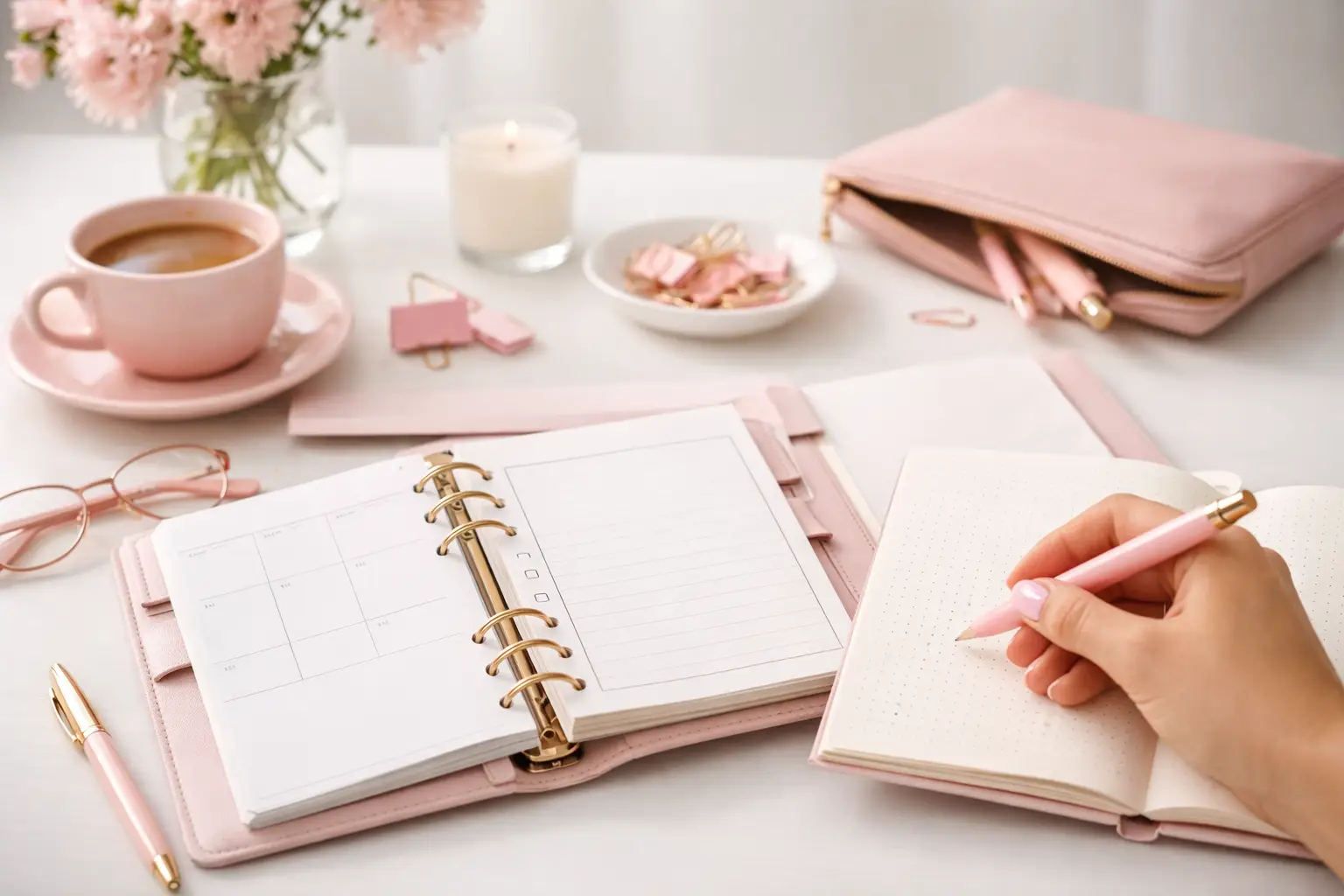
Wondering which planner pages do i need? Build a practical paper planner with only the inserts that support your real routines, goals, and plans daily.
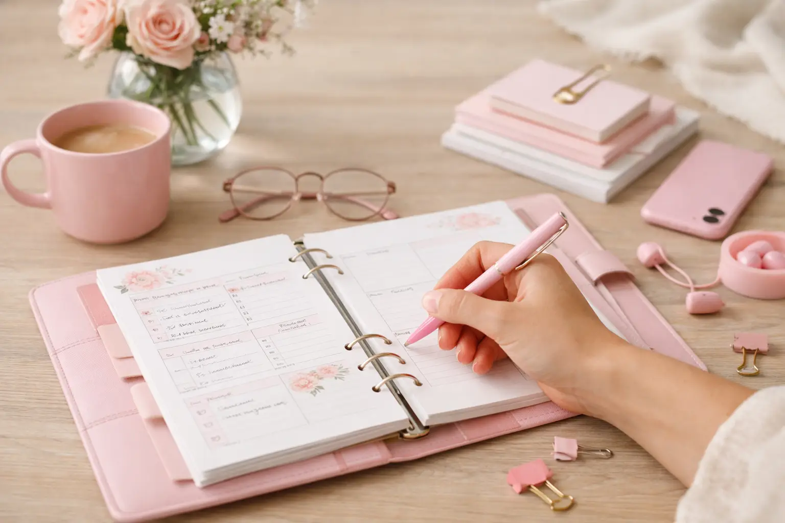
The future of printable planners favors flexible, beautiful systems: print what fits your week, refresh routines, and keep every page useful for life.